Simultaneous editing feature for SaaS CMS
Kentico Kontent (jan 2020 - jun 2020)
My
Role
Contributor / Designer :
Product and problem space discovery, problem definition, facilitation of design workshops, interaction and UI design, usability testing, quantitative analysis
The
Team
I Co-Created the solution with a team of 6 developers (including CTO getting his hands dirty with some code) and one Product Manager.
And of course with great advice and feedback from UX team.
The
Outcome
We shipped this feature as the first Headless CMS to offer such capability in the market. 🥇
It since has proven to be a positive differentiator in multiple enterprise-tier deals
Product and audience
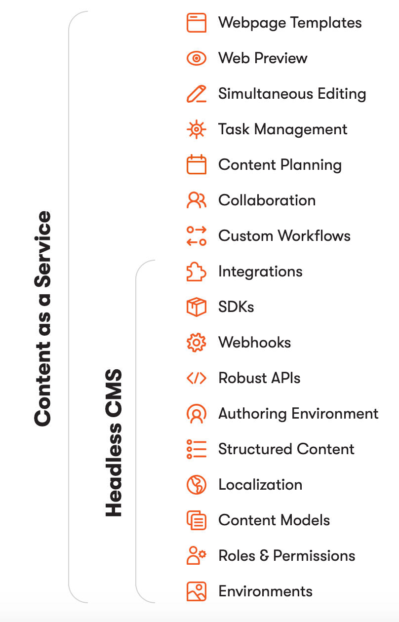
Kentico Kontent - Headless CMS
Basically a one-stop-shop for all content needs of any project or company. From the smallest ones to huge enterprises and organisations such as Škoda, BMW or Oxford university. Whether they need to create content, keep it organised in a same place, manage or plan anything content connected or publish it practically on any channel (e.g. on a website, in app, on a wearable or export it for print), they can do it all from Kontent.
audience
Mainly content editors, copywriters and content managers in larger companies or enterprises.
Process
01
Mapping the problem space
Exploration:
As it should always be, I kicked off my design process with exploring and researching the problem space. This issue was stemming from a long felt usability pains and issues. Also there were already some previous attempts to solve them so I knew I needed to pay special attention to the framing and anchoring of the problem done previously.
I spent most of this stage doing secondary research – I researched and analysed the user feedback we collected over the years either actively during user interviews or usability testing sessions, or which was sent by our users via Intercom or other communication channels. I learned that the issue prevented bigger, distributed teams from efficiently collaborating on a piece of content, event if there was fairly low risk in messing up each others' work.
The UI, copy and interaction patterns were quite ambiguous and were perceived as such by our users - and to be honest I was not surprised why:
I dedicated the second part of my exploration to the previous attempts of solving this problem and this proved to be probably the biggest elephant in the room. there was already a production-grade prototype of a solution in google docs style outr CTO created in his innovation time. It achored the conversation in really bad way, the expectatoins were uneccesarily high and almost whole team looked only in this direction for the solution. Anything less was viewed very skeptically in terms of potential value for our customers. And technically speaking – to follow up in this course would mean a need for overhaul much of the inner workings of our editing systems as well as do big changes in how we handle data transfers. That would cost us at least a year of pure development time.
The last part I assessed was a bit more holistic view on the product – the possible impact of this issue on both the ongoing feature initiatives and those in the pipeline. Simultaneously with this opportunity, other teams were solving issues of multi-role collaboration and commenting and in the pipeline were large and important features such as in-context WYSIWIG-like content editing or offline experience of our product. Therefore any larger intervention would impact plans and work of several other teams.
Risk identification and assesment:
Initial anchoring to complex Google docs-style solution created huge expectations and a big potential cost and scope owerflow
Lean solution might be not comfortable enough for users and they might feel unsafe and afraid to use it.
Large intervention might complicate and hinder progress on other product features.
02
Problem definiton
After exploring the feedbacks and assessing the product and technical limitations we started to narrow the problem space and set up a couple of sessions aimed at diverging to a singular problem definition. After a couple of iterations in a smaller product team (Designer, Product manager, Technical leader) we distilled the definitions of two main problems:
1. Content producers are afraid to edit content if anybody else is working on that, because of possible conflicts.
2. Content producers are not sure if they can work on content or somebody else is editing it at the same time.
03
Designing the solution
Explore the solutions space
I had formed some rough solutions throughout the whole process, however at this particular stage I ran a few cycles of design studio workshops with both my design colleagues and my development team. The ideas we generated ran in a couple of different directions at first but some patterns started to emerge and repeat.
What is the smallest possible thing we can do to unlock the value to our users?
After a longer consideration I decided to take a seemingly counter-intuitive path and try to design a smallest possible product intervention I could. I tried to find the smallest thing that would help our users and unblock value to our customers. The full scale, Google docs - style interactions were simply not feasible and would delay the solution by potentially years as well as it would be posing quite a big risk of mistakes and failures.
Simplify more
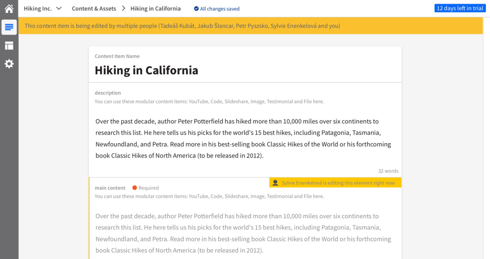
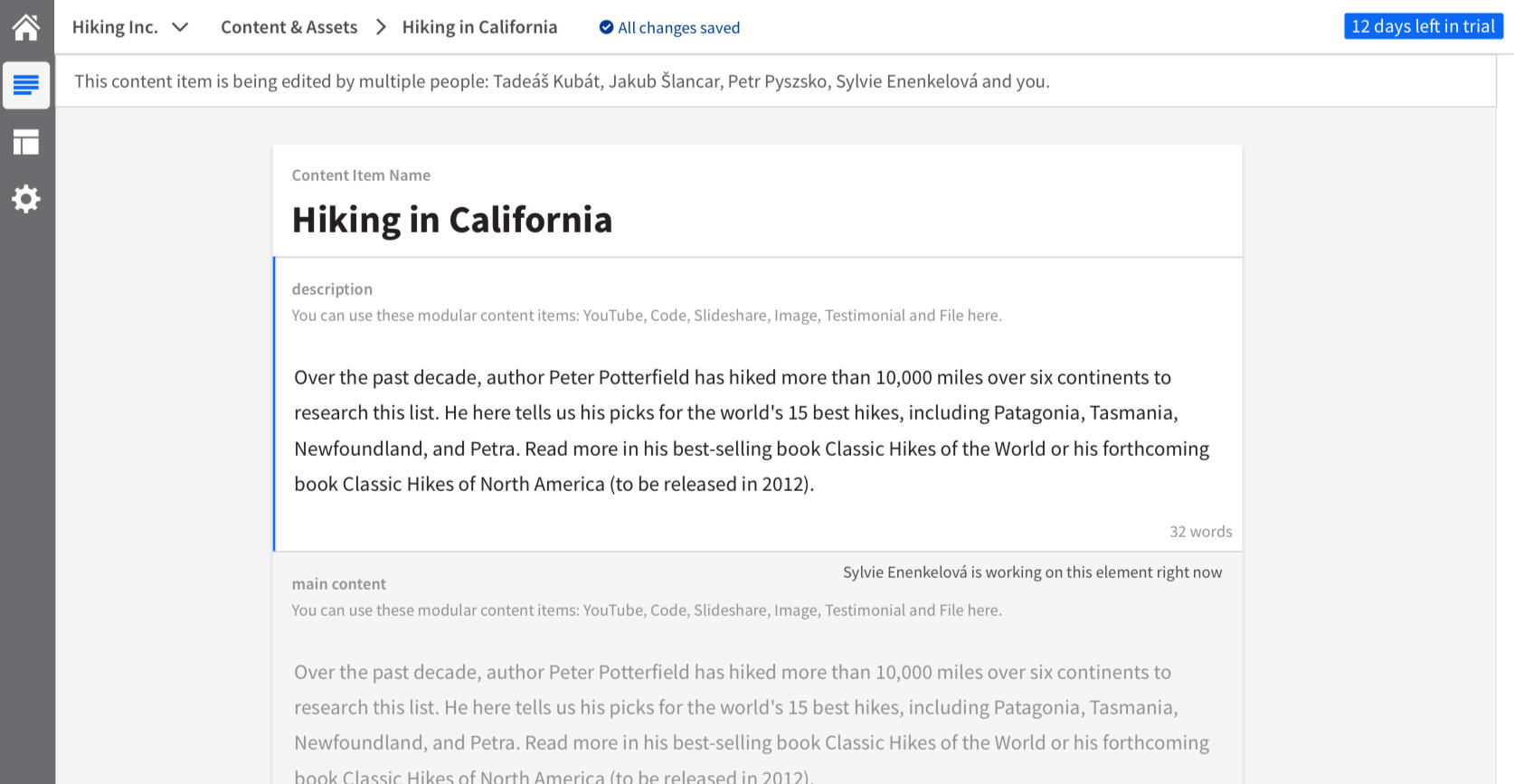
The best solution turned out to be the the automatic "locking" of specific parts of content. Whenever someone changed a smaller piece of content, it rendered itself inaccessible to other users present in the same document. After the user finished editing the piece of content rendered itself editable (with some short time delay, to prevent mishaps) This addressed the users' need for security - transparently and explicitly communicated fact that "this content is mine right now and you shouldn't touch it", and prevented collisions between various users.
Address all issues
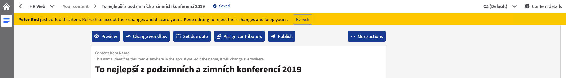
The other uncertainty we identified in our users - that they are not sure if they can work on something - we addressed by redesigning the ugly notification bar into a bit more friendlier and more actionable one.
Check out the examples of the design in various stages:
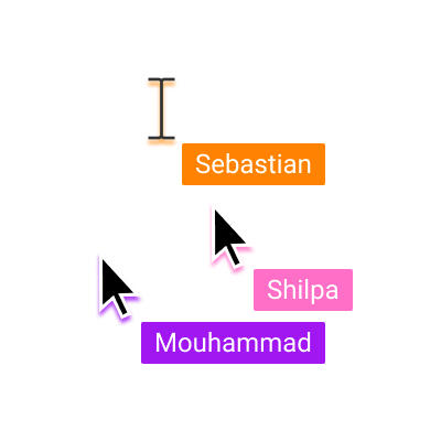
Basic wiferames and user flow sketches from one of the workshops

First iteration of the whole simultaneous editing UI:
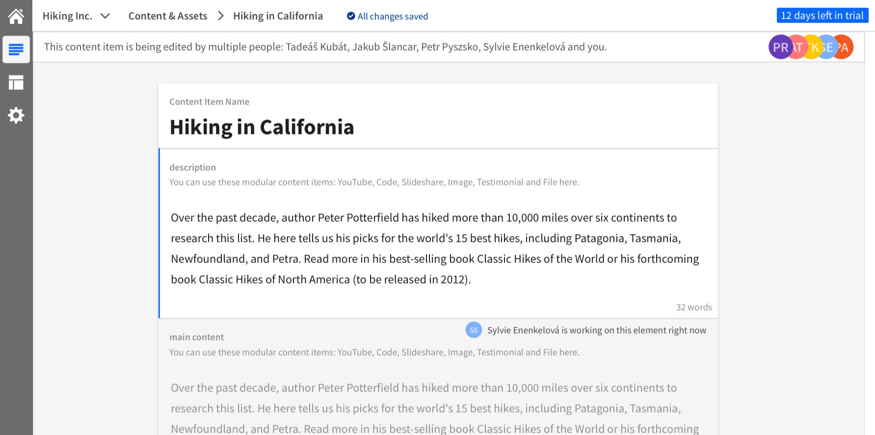
Alternate visual version of notifications:
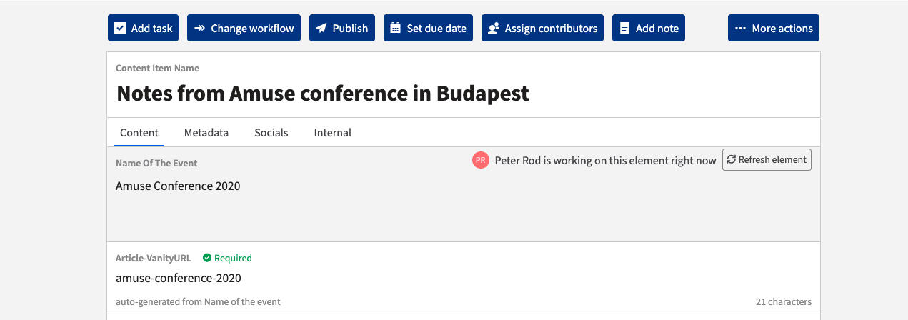
Detail of the content locking and refreshing interaction:
04
Prototyping and Usability Testing
UX Review
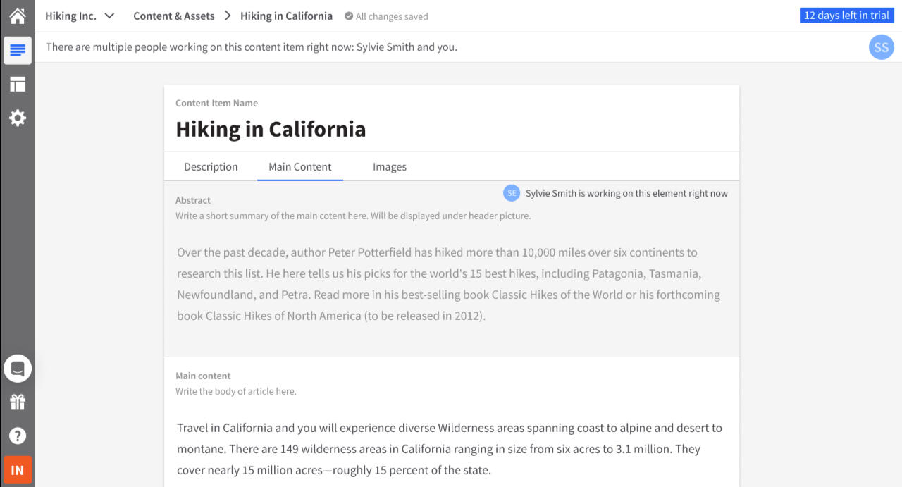
Already before I started with preparation of usability testing I ran the designs through quick 5s tests with our internal users and a round of formal review by our UX team. Based on their feedback (looks and feels too aggressive or in some cases sterile) I iterated on the preliminary UI designs, so they did look a bit more clear and friendly:
Usability testing
Even if the solution designed was much smaller and cheaper to implement than originally thought we wanted to minimise and mitigate the possible usability issues.
The goal of this testing was to make sure our users understand the changes we were going to make in the UI and also to be sure they area able to resolve potential conflicts that might happen during either simultaneous editing scenarios or as consequences of document wide changes (deleting, publishing, etc...)
I formed a couple of research questions and hypothesis of what I'd like to test:
Do users understand the meaning of the item-wide alert?
Do users understand the element-wide alerts (disabled states)?
How do users understand the conflicting changes dialogue in an element?
How do users understand item-wide change alerts (e.g., somebody has deleted/changed the whole item)?
And with a help from our UX researcher I formulated testing scenarios for all of these questions.
After that, I created aa simple figma prototype that covered the needed scenarios:
I conducted a remote usability testing sessions with a couple of our real external users all around the world and noted down some findings and insights it brought us.
After a quite extensive consultation with our UX researchers we came to a conclusion that the main goal was to see if users understand and how do they viscerally react to what's going on in the interface, so we decided not to measure SEQ or any other usual metrics during this testing.
Iterating based on the insight.
Probably the main surprise and insight we've gained from the usability testing was that the bar notifications we've used to alert user about the fact they're not alone in the document were almost always overlooked.
Another important insight was that the copy and interactions we've designed for resolving the edge cases (less than 0.1%) which occurred when more users edited the content at the same time, was very unclear. Same went for a "copy to clipboard" functionality which our testing users found useless.
So we've fixed the visual prominence of the alerts (by using animation and more colors), got rid of confusing interactions and with a help from our UX writer we've got a much more understandable copy
05
Product grooming and planning
After making sure the solution we came up with is both usable and valuable, we focused more deeply the issue of feasibility.
We wanted to get the value to our customers as fast as possible, so we cut the stuff that wasn't absolutely necessary for the core functionality and divided the whole feature into 3 separate releases. This also gave us the possibility to collect more data and feedback from the real product and usage and iterate and build on that. We cut the feature in these releases:
Phase 0 - implement whichever tracking on current usage we're missing
Phase 1 - Earliest Testable product - conflict prevention, notification of multiple users present in the document. Generic notifications on document-wide changes
Phase 2 - locking interaction finetuning, Granular notifications on the cause of document wide change
Phase 3 - multi-tab concurrency (identifying and communicating that the document is opened by the same user), fine tuning the copying the content in case of conflict caused by update via API (which held priority over input via UI)
Thanks to the continuous data collection and analysis we were able to react and tailor the feature according to our users needs. We collected various metrics such as: number of simultaneous editing sessions, count of editors at the same time, which operations they performed, number of conflicts between editing from UI and pushing content via API, etc...
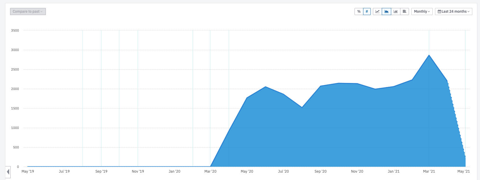
However one metric that guided us throughout the whole process was the number of simultaneous editing sessions. Our preliminary hypothesis was, that our users are afraid even to try to edit documents simultaneously in the first place.
As you can see by the gradual growth of the occurrence of simultaneous editing sessions (marked by more than 2 real users editing a document at the same time for at least a minute) the usage and adoption of this feature was successful and each iteration marked an improvement in adoption as well 👇
Shipping and impact
The release of the feature was just the beginning of its journey and we made sure to get it started and spread the word in a best way possible. We held an introductory webinar where I explained the workings and benefits of the solution and a new feature messaging distributed in-app to all the users. All this helped us to address the potential risk that users might still be worried to use the feature.
The immediate impact we felt was that by choosing simpler and more efficient solution we cut the development time to 1/3 of the original estimate.
We were the first Headless CMS to support simultaneous editing in the market! 👉
And it made a difference in larger deals such as this one 👇

Weʼre extremely proud to say that Kontent is the first (so currently the only) headless CMS that supports Simultaneous Editing! 🥳 Read all about it in our latest product update:#HeadlessCMS #ContentCreation #collaborationhttps://t.co/3b4XBkoKEU
— Kentico Kontent (@KenticoKontent) July 14, 2020
What did I learn:
Even solution that looks “tiny” in comparison with the behemoth of original solutions can take a long time.
Take my time with understanding the problem — it was a test in patience (and driving me crazy at times), but it was worth it.
The old Lincoln’s saying about sharpening the axe is true: rather take 9hrs to sharpen the right tool and then do the job in 1hr with just very precise surgical incision
None of the stuff can be done without the most kickass, patient and devotedteam. Value, cherish and praise them wherever you go.
It’s easy to be submerged in the problem — get outsiders’ view, discuss the problem with people who are not involved in solving this problem, train to describe the problem as briefly as possible (as it frames your thinking differently).
© Peter Rod. All rights reserved.